Boosting Technology Adoption through Dynamic and Intuitive Icon Design
🎩 Role / Lead User Experience & Service Designer | **Strategic UX Leader & Facilitator
✅ Task/ Led the user experience strategy and facilitated dynamic workshops to define and optimize the software client customization for emergency services. Developed a scalable design system ensuring consistency across digital platforms.
♥️ Client / London Fire Brigade, 2022.
💡 Keywords/ Agile, Design System, Teamwork, Processes, User-Centered Design, Interoperability, UX Strategy, Information Architecture, Service Design, Human-Centered Innovation
Project Overview

Context
Firefighters in high-pressure environments rely on intuitive, instantly recognizable iconography. But here’s the catch: there wasn’t a universal language for firefighting icons. In the middle of a digital transformation, we were still at square one when it came to standardized iconography.
Emergency Services were facing an era of digitalization; new technologies were being rapidly implemented, from heat cameras and drones to GPS tracking. While these tools were undeniably useful, they all had one big problem: they didn’t speak to each other.
This is where the company I worked for came in—offering a unified platform with an intuitive interface that allowed users to seamlessly access data, helping them make better and faster decisions. As part of this transformation, AI-powered machine learning would learn from past incidents and suggest potential actions—without interfering in decision-making but acting as a smart assistant for emergency responders.
So, I rolled up my sleeves and designed a foundational visual language from scratch to bring clarity, adoption, and efficiency to the system.
The Challenge
Key issues
Firefighters have seconds to make decisions, and the last thing they need is an icon that makes them pause and think, Wait, what does this even mean? Firefighters must make split-second decisions, often in high-stress scenarios. However, the existing icons were ambiguous and difficult to interpret, leading to frustration and inefficiencies. Key issues included:
Lack of visual consistency
Difficulty in quick recognition of essential tools
Low adoption of the system due to unclear icon meanings
To solve this, I took inspiration from maritime flags, which serve as a universal language at sea, much like Esperanto for visual communication. This approach provided a structured yet intuitive framework for designing firefighting icons that could be easily understood across teams.
“My goal was to create an intuitive, research-backed icon set that facilitated rapid decision-making and improved usability”
My role
I was responsible for:
User Research: Talking to firefighters (a lot) to understand how they process visual information.
Usability Testing: Setting up an icon-ranking system and watching people struggle so I could fix it.
Design & Prototyping: Making and remaking icons until they actually worked.
Collaboration: Working with fire station leadership, UI developers, and JESIP teams—more on them in a second.
Design Process
Research

I spent time with firefighters, observing how they worked and deciphering their feedback (which was refreshingly direct). The biggest issue? Icons that made them hesitate—and hesitation in their world isn’t an option.
To ensure cross-service usability, I teamed up with JESIP (Joint Emergency Services Interoperability Principles), a UK initiative focused on helping emergency services work better together. They provided insights on how the icons needed to work across fire, police, and ambulance services—not just for firefighters alone.
Additionally, I conducted usability studies, interviews, and interactive ranking sessions to understand how emergency responders visually process information under stress.
Testing
I knew that just designing icons wasn’t enough, they had to work under real-world conditions.
So, I set up a testing process that put these icons through their paces.

Baseline Testing – We started with what existed, gathering firefighter feedback on why the old icons weren’t working.
Iterative Design Sprints – I rolled out new icons every week based on firefighter input and usability studies. Some designs flopped. Some were instant hits.
Live Field Testing – Firefighters used the new icons during training drills. If an icon caused even a split-second of confusion, it went back to the drawing board.
Final Refinements – After multiple rounds of testing, I fine-tuned the icons based on direct firefighter feedback to ensure maximum clarity and usability.
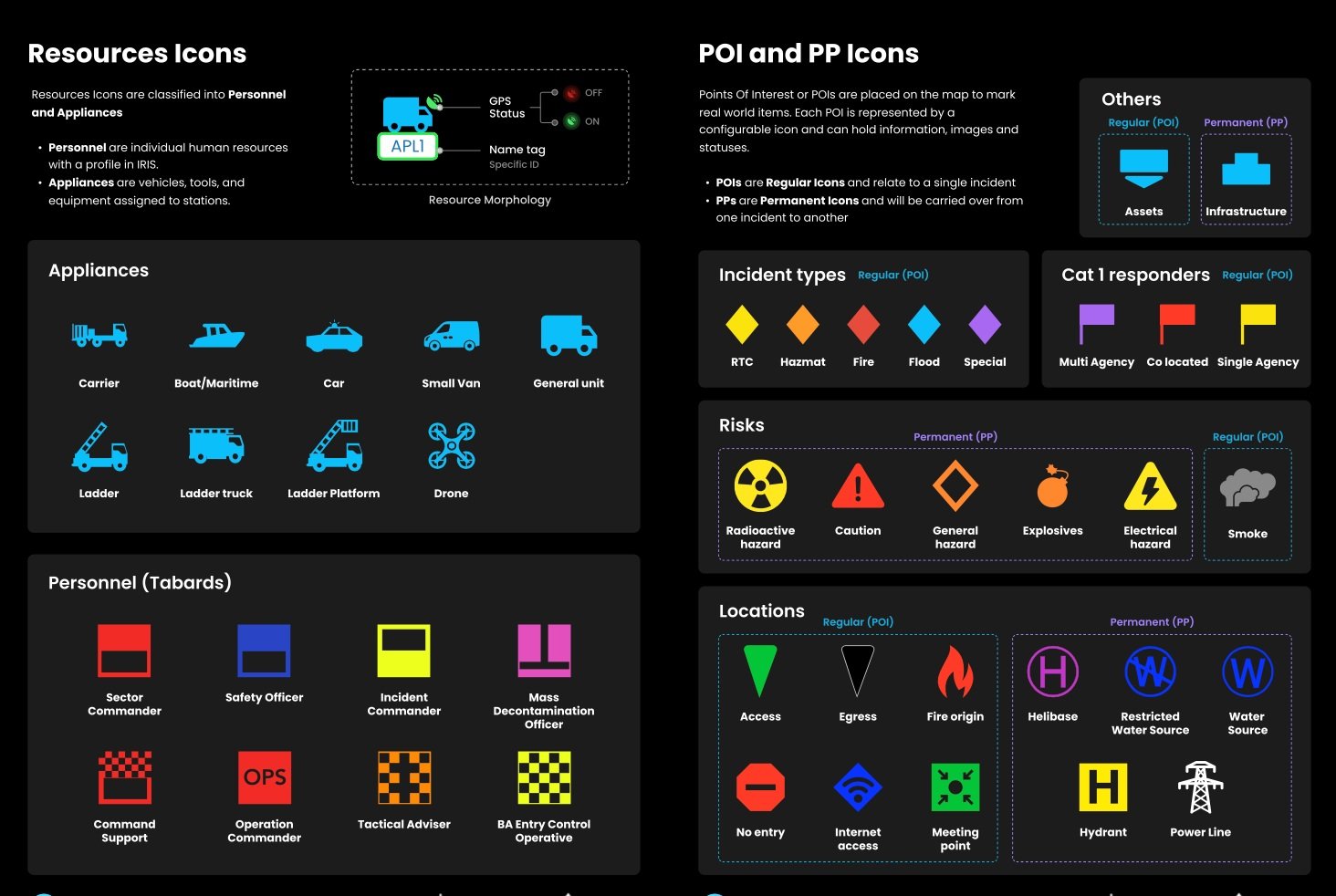
Solution
The redesign didn’t just make life easier for firefighters—it set a new standard for how icons should function across emergency services. Thanks to the collaboration with JESIP, the icon system became a scalable solution that could be adapted for future technological updates.
✅ High-contrast colors significantly improved visibility in low-light and smoke-filled conditions.
✅ Simplified shapes were easier to differentiate at a glance.
✅ Standardized iconography aligned with firefighter workflows, making the system intuitive from day one.
Impact
Posters and infographics shared by the stations
The redesign didn’t just make life easier for firefighters, it set a new standard for how icons should function across emergency services. Thanks to the collaboration with JESIP, the icon system became a scalable solution that could be adapted for future technological updates
By deeply involving the London Fire Brigade’s personnel in the design process, we created an iconography system that was not only functional but also deeply connected to the firefighters’ real-world experiences. This approach led to a 30% increase in user adoption within the first three months of deployment and a 25% reduction in onboarding time for new staff. The improved usability and intuitive design ultimately enhanced training outcomes, with feedback indicating a 40% reduction in errors during real-world use.
Lessons & Insights
User research is non-negotiable. You think you know what people need, until you ask them.
Testing and iteration save lives. Watching real users interact with my designs showed me what worked (and what really didn’t).
Collaboration makes adoption easier. Working with JESIP ensured these icons weren’t just for firefighters but for all emergency services.
Design inspiration comes from unexpected places. Who knew that sailing flags would be the key to cracking the code for emergency service icons?
This project was an eye-opener: Not just in how icons can improve safety, but in how thoughtful design can create universal, intuitive, and high-impact solutions.