Simplifying User Experience: The Art of Manual Creation
🎩 Role / User Experience & Service Designer Lead
✅ Task/Developing a user-centric end-user manual for software training, ensuring clear and comprehensive instructions to enhance user proficiency and productivity.
♥️ Client / Internal corporate work
💡 Keywords/ End-users, Onboarding, Technology adoption.
Even with the best user experience, understanding an Incident Command System Software can sometimes be complex, especially during the initial stages when familiarity is crucial for successful adoption. The first phase involves adapting the scenario to match users' vocabulary and assets. Therefore, it was essential to provide useful, concise, and easy-to-understand documentation so that stakeholders within the organization, who may not always be the most tech-savvy, could try the system, comprehend its capabilities, and, most importantly, see how it addresses their pain points.
As the sole User Experience designer in the company at the time, I had to devise a quick solution that would allow users to explore the system in a testing environment.
Challenge
The reality is that not all prospective clients will convert into final sales, but everyone interested in the system deserves the opportunity to try it out. This situation prompted us to design materials that could be shared across various organizations, countries, and languages. The main challenges I had to overcome were:
Providing materials to users to prevent them from wasting time searching for icons, pictures, etc.
Preparing resources tailored to their environmental context.
Establishing a fluid communication channel to address any possible questions that might arise (Additionally, gathering feedback simultaneously would be highly beneficial).
Ensuring scalability and accessibility while maintaining control over who is using the system.
Keeping the tests separated so that different people could access them without interfering with others' tests.
Iterations
Initially, we figured a PDF would be enough to get us going. Just a straightforward document with some basic access details seemed like a solid plan. However, we quickly ran into a few snags: keeping tabs on who accessed it proved tricky, not everyone grasped how to access the document, and the real challenge was staying on top of updates.

Once we refined the PDF with some hyperlinks and established a public drive space for testers to access the prepared material packages, our system began to take form. Each time someone clicked on the invitation link, it triggered an email requesting access, serving as a rudimentary method to monitor active participants and identify individuals we could approach for feedback.

This approach not only simplified the process for testers to obtain the necessary resources but also provided us with a mechanism to gauge engagement and tailor our outreach efforts effectively. engagement and tailor our outreach efforts effectively.
In addition to the enhancements mentioned earlier, we also developed a glossary of terms in PDF format. This resource ensured that every tester or prospective user, regardless of their background or expertise, could fully grasp the content of our documentation. By providing clarity on industry-specific jargon and technical terminology, we aimed to eliminate any potential confusion and streamline the user experience.


Outcome
After sifting through all iterations, it dawned on us that there was a need for something that could scale effortlessly, especially as our potential clients transitioned into loyal customers. It became clear that we needed a comprehensive solution, one that could intricately detail every aspect of the software without leaving our users scratching their heads. So, I had this lightbulb moment: why not whip up an end user manual in Notion?
After doing a bit of research, it was crystal clear that Notion ticked all the boxes.
It's intuitive, web-based, and doesn't require a PhD in tech to navigate. And the best part? We could always switch to a more specialized platform down the line as our needs evolved.
With this move, our aim is to arm our clients with all the information they need to make the most of our software in a way that's not only easy to access but also a breeze to comprehend. It's all about smoothing out the process for everyone involved and laying the groundwork for our long-term success.

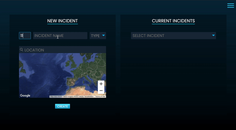
Main interface

Main interface
Furthermore, to enhance the user experience, we took the initiative to design GIFs. These animated graphics were specifically created with our end users in mind, providing them with an intuitive way to remember how to navigate the software effectively and unleash its full potential. This approach not only aims to empower our clients but also adds an element of enjoyment to the learning process.
Moreover, each chapter of the end user manual will include detailed, step-by-step instructions.
GiF’s developed for the training

These guides are meticulously crafted to lead users through every aspect of the software, ensuring that they can effortlessly follow along and complete tasks with confidence.
By simplifying complex actions into easily digestible steps, our goal is to equip users with the knowledge and skills to navigate the software seamlessly and optimize its functionalities. With these clear and concise instructions readily available, our clients will feel supported and empowered to leverage our product to its fullest extent.
Additionally, we will incorporate annotated images into the manual, where each element is labeled with explanatory notes.
This visual aid will further clarify the instructions, making it even easier for users to understand and apply them accurately. By combining clear, concise instructions with visual references, our goal is to equip users with the knowledge and skills to navigate the software seamlessly and optimize its functionalities. With these comprehensive resources at their disposal, the clients will feel fully supported and empowered to make the most of the product.
So, what it was the good things that came up at the end?
Keep Improving: We started with a simple PDF and then just kept tweaking based on what users told us. It's all about being flexible and ready to change things up when needed.
Put Users First: Putting ourselves in the users' shoes. Whether it was creating easy-to-follow GIFs or breaking things down step-by-step, everything was about making life easier for them. It's all about keeping it real with our users.
Stay Flexible: Dealing with problems and finding solutions taught us the importance of staying open to new ideas. We quickly realized when something wasn't working and weren't afraid to try something new, like switching to Notion. It's all about rolling with the punches and being ready to switch things up when needed.
Thanks for reading